Motion Design’s Holy Grail: The Title Sequence
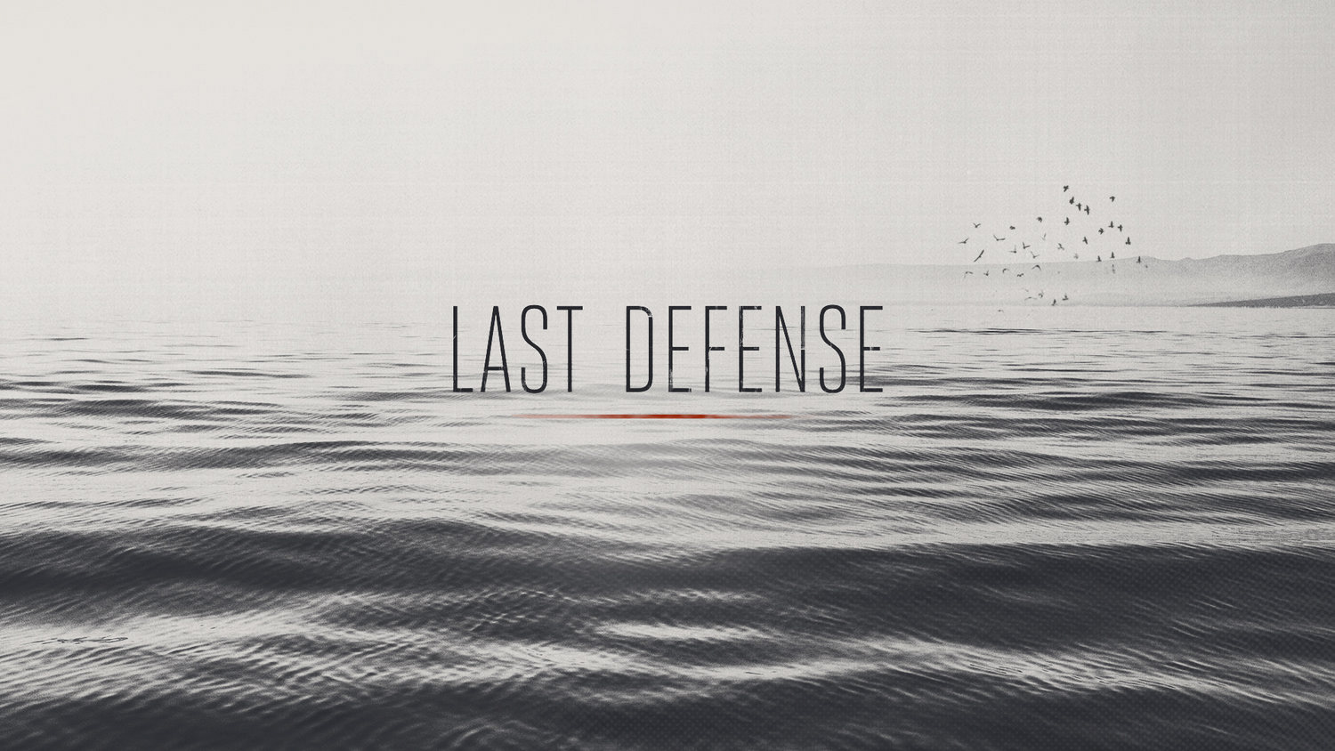
In the fall of 2017, I was transitioning from my staff position at a studio in Boston to full-time freelance. My final job happened to be a pitch that often proved extremely allusive for myself and the other members of the team. It was a chance to pitch for a show open, in this case ABC’s The Last Defense. The show is a docuseries that navigates the U.S. criminal justice system, showcasing death row inmates — their stories, and their fates.
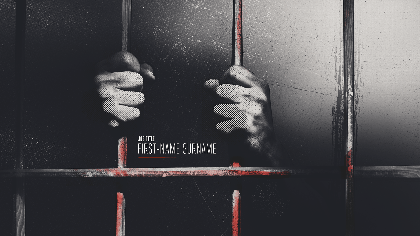
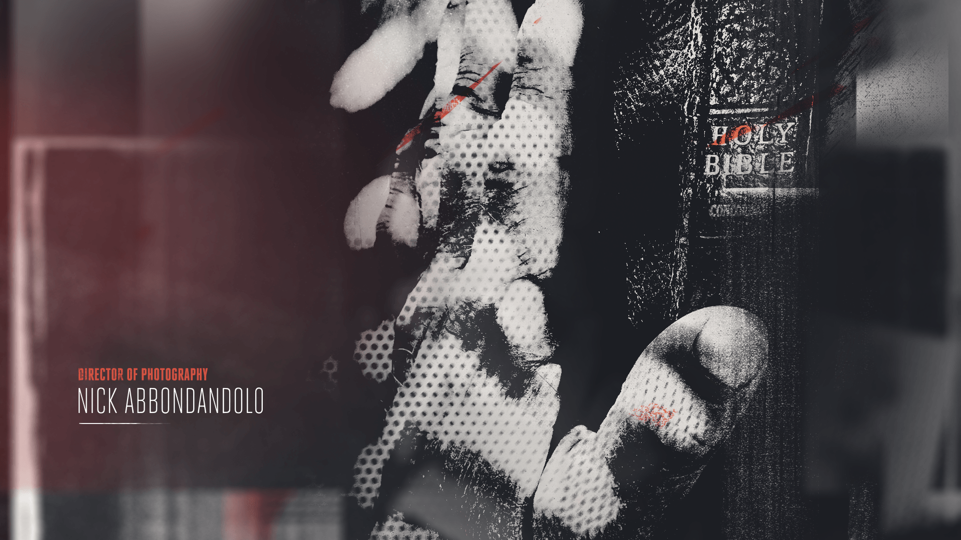
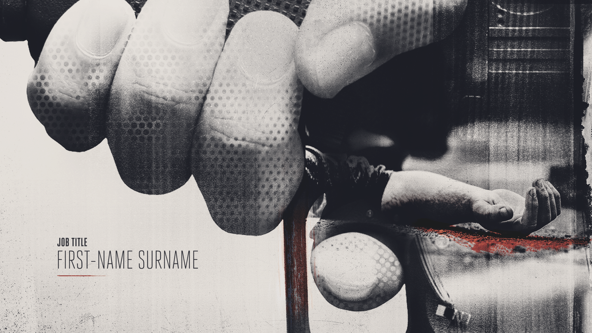
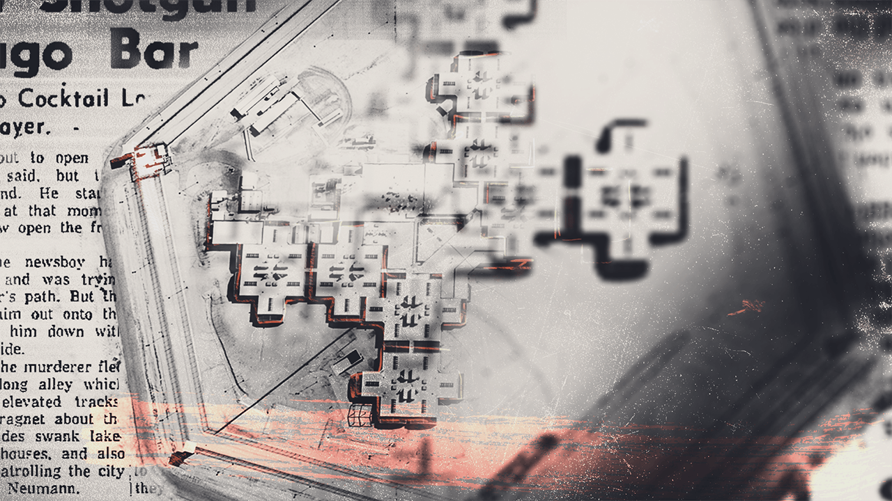
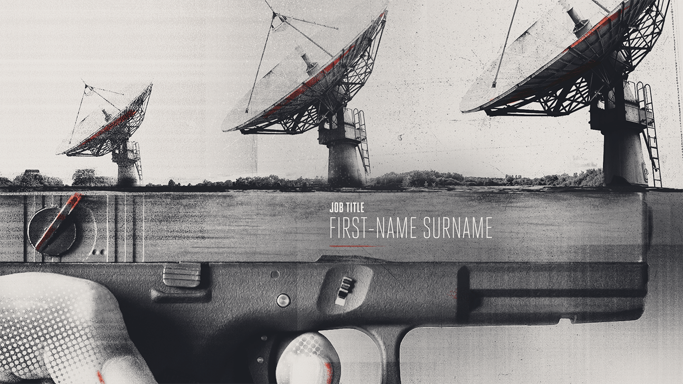
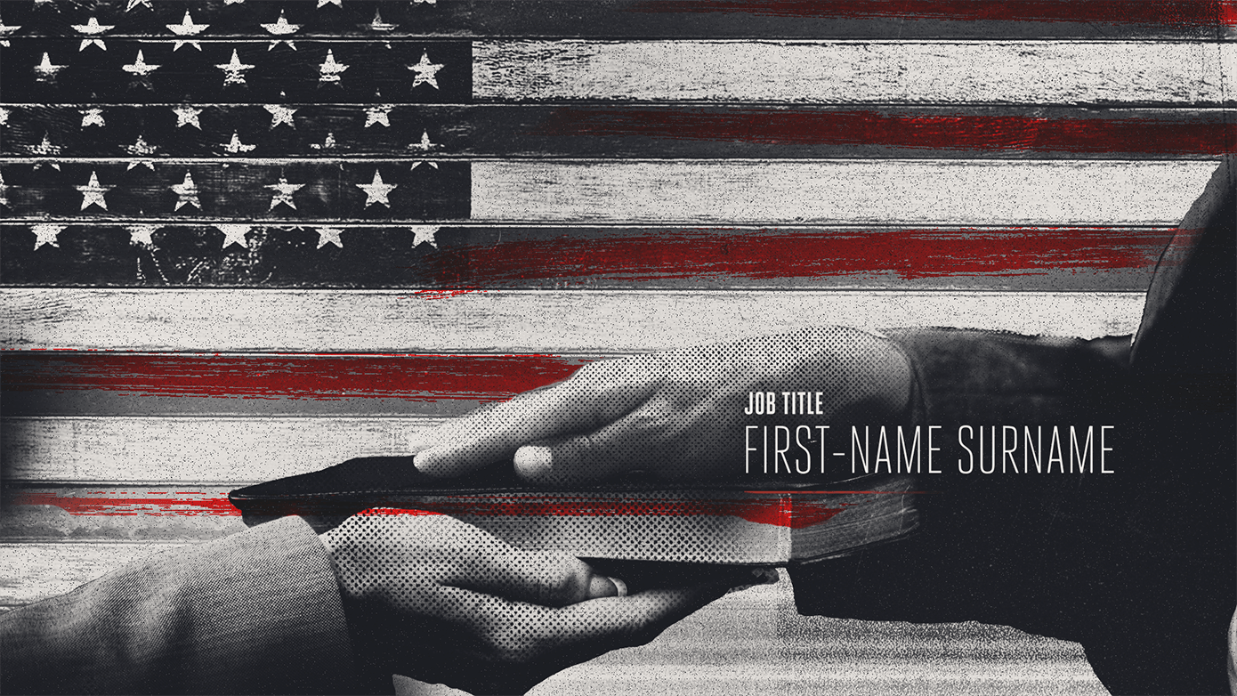
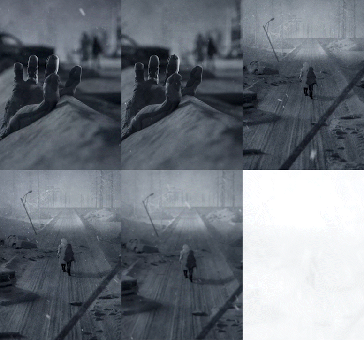
We pitched 3 designs and directions, in which mine was selected and eventually produced for the final piece. The intention was to take the viewer on a seamless journey through the entire justice system process related to death row cases — beginning with the alleged crime and ending with the outcome (a hopeful finale in our case). Along the way, I wanted to touch upon other aspects of the journey, including the jury, testimonies, and media influence.
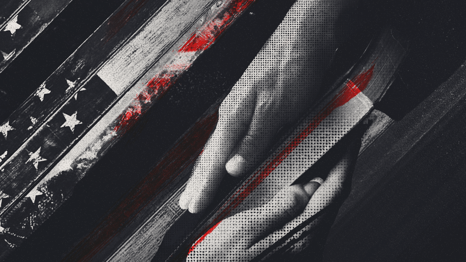
I used a graphic look mixed with photography, grit, and half-tone to set a dark and ominous mood. I designed and envisioned unexpected transitions that blended geometry and merged different objects together. Red was used to accent a mostly black and white color palette and serve an additional purpose: The justice system, typically thought of as a black and white construct, is visually broken up by red, a symbol of disruption, blood, and injustice.
Ironically enough, my time ran up at my job before I had the chance to animate it. I certainly would have loved to have had a hand in both the pre-production and production stages. Nonetheless, the team did a great job and the look remained consistent with my original boards.
Client: Lincoln Square Productions
Studio: Viewpoint Creative
Year: 2017-18
Role: Art Direction, Pitch (Selected) Design
Project: Opening Title Design
Additional Credits: Design – Mike Frederick, Nick Ford
